Kong
[Moderator]
7855

Golden Section and Double Aperture - The A. Lange & Söhne Design Principles
Timepieces
by A. Lange & Söhne are characterised not only by timeless elegance
but also by their striking recognisability. Debut model sketches
provide insights into the work of the Lange designers.
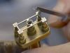
Gerrit Rietveld, an eminent 20th-century designer and architect, argued that construction and beauty need not be contradictory. For the same reason, A. Lange & Söhne's product designers work closely with the calibre engineers right from the beginning when they develop new models. In an elaborate inception process, they must reconcile the grand idea with scores of seemingly insignificant details. The objective is to harmonise technology and aesthetics, tradition and modernity.
Gerrit Rietveld, an eminent 20th-century designer and architect, argued that construction and beauty need not be contradictory. For the same reason, A. Lange & Söhne's product designers work closely with the calibre engineers right from the beginning when they develop new models. In an elaborate inception process, they must reconcile the grand idea with scores of seemingly insignificant details. The objective is to harmonise technology and aesthetics, tradition and modernity.

In the GRAND LANGE 1, the off-centre configuration of the displays follows the principle of the golden section.
From the
first rough sketches to final acceptance, the design of a dial alone can
take up to two years. For Lange designers, repeatedly questioning the
validity of their own drafts is part of the job. On the long, arduous
path to the final version, they assess countless variations that often
differ from one another only in diminutive details. They are appraised,
compared, passionately discussed, and reworked yet again. But grappling
with fractions of a millimetre is the only way to come up with the best
solution among many good ones.
The result: watches with designs that remain influential for decades and which can be readily recognised as "an A. Lange & Söhne" even without the famous arced brand signature. Prominent design elements such as the asymmetric dial layout and the outsize date with a double aperture transformed the LANGE 1 – first introduced in 1994 – into a style defining icon. It is no doubt the most famous model of the venerable Saxon brand. With its double-aperture date inspired by the stage clock in the Semper Opera House and the off-centre dial architecture, the LANGE 1 wrote design history. The non-overlapping arrangement of the displays reflects the harmonious proportions of the golden ratio. Since antiquity, it has been considered a paragon of aesthetic equilibrium.
Apart from the obvious ones, the distinctiveness of timepieces crafted by the Saxon manufactory is often based on very subtle features. Such details include the gracefully sculpted lugs, the elegant lancet-shaped hands, the engraved look of the typography, or the interplay between the case material and the dial colour, which is balanced explicitly in the interest of aesthetic appeal. Featuring debuts for the year 2013, a few sketches from the A. Lange & Söhne designers illustrate how the manufactory repeatedly succeeds in melding the quest for emblematic timelessness and brand recognition.
GRAND LANGE 1: Black on white

The
latest model of the GRAND LANGE 1 owes its expressive face to the
contrast between the black solid-silver dial and the graceful white-gold
case. Thanks to luminous hands and appliques in rhodiumed gold, the
time and power-reserve readings are highly legible even in the dark. The
focus on its black-white polarity is heightened by a black crocodile
strap and a Lange prong buckle in solid white gold.
GRAND LANGE 1 "Lumen": Luminescent secret

For
nearly 20 years, the secret of the revolutionary Lange outsize date
remained concealed beneath a solid-silver dial. For the first time ever,
the GRAND LANGE 1 "Lumen" exposes the complex mechanism. The discs of
the first luminous outsize date are now visible through semi-transparent
sapphire-crystal dial segments. To optimise the luminosity of the date
display after the switching cycle around midnight, a transparent units
ring with black numerals rotates over a glowing background rectangle. As
befits the exclusivity of the technical and design prowess that it
embodies, the GRAND LANGE 1 "Lumen" comes in an edition limited to 200
platinum-cased watches.
1815 UP/DOWN: Reminiscence of the pocket watch

The
models of the 1815 watch family project sleek dignity at the pinnacle
of watchmaking artistry. In the new 1815 UP/DOWN, a separate dial at 8
o'clock indicates how much of the 72-hour power reserve remains
available. The geometry of the indicator with the inscriptions "AUF" for
fully wound and "AB" for fully unwound is an A. Lange & Söhne
tradition. Arabic numerals, blued-steel hands, a railway-track minute
scale, and symmetrically arranged subsidiary dials for the power-reserve
indicator and the running seconds are reminiscent of the principles
that governed the design of Lange's famous pocket watches.
SAXONIA ANNUAL CALENDAR: Purity, clarity, beauty

The
development of the SAXONIA ANNUAL CALENDAR was driven by the desire to
achieve clarity and harmony in the arrangement of its many displays.
With its baton-style hour markers, the puristic minute scale, and
symmetrically arranged calendar indications, the dial is articulate and
well-organised. Accents include the brand-typical lancet hands and the
perfectly legible Lange outsize date in the characteristic double
aperture. The concept is rooted in a modern design principle that
derives aesthetic appeal from functionality and visual eloquence. The
version presented this year, in a coolly lustrous platinum case with a
rhodié-coloured dial, emphasises the design trilogy that unites purity,
clarity, and beauty.
SAXONIA AUTOMATIC: Brilliant elegance

A.
Lange & Söhne timepieces combine the best of two worlds: genuine
artisanship and timeless elegance. Ennobled with 76 brilliant-cut
diamonds, the new SAXONIA AUTOMATIC was developed with the ambition to
create a perfect symbiosis of technology, craftsmanship, and design. The
solid-silver dial, framed by a diamond-set bezel, perfectly complements
the slender silhouette of the case in solid white or pink gold. With a
height of merely 3.7 millimetres, the L086.1 self-winding movement is
the Saxon manufactory's thinnest calibre.
Press Release
This message has been edited by Kong on 2013-07-29 07:57:24
More posts:
Locked
login to reply
Golden Section and Double Aperture - The A. Lange & Söhne Design Principles
Timepieces by A. Lange & Söhne are characterised not only by timeless elegance but also by their striking recognisability. Debut model sketches provide insights into the work of the Lange designers. Gerrit Rietveld, an eminent 20th-century designer an...